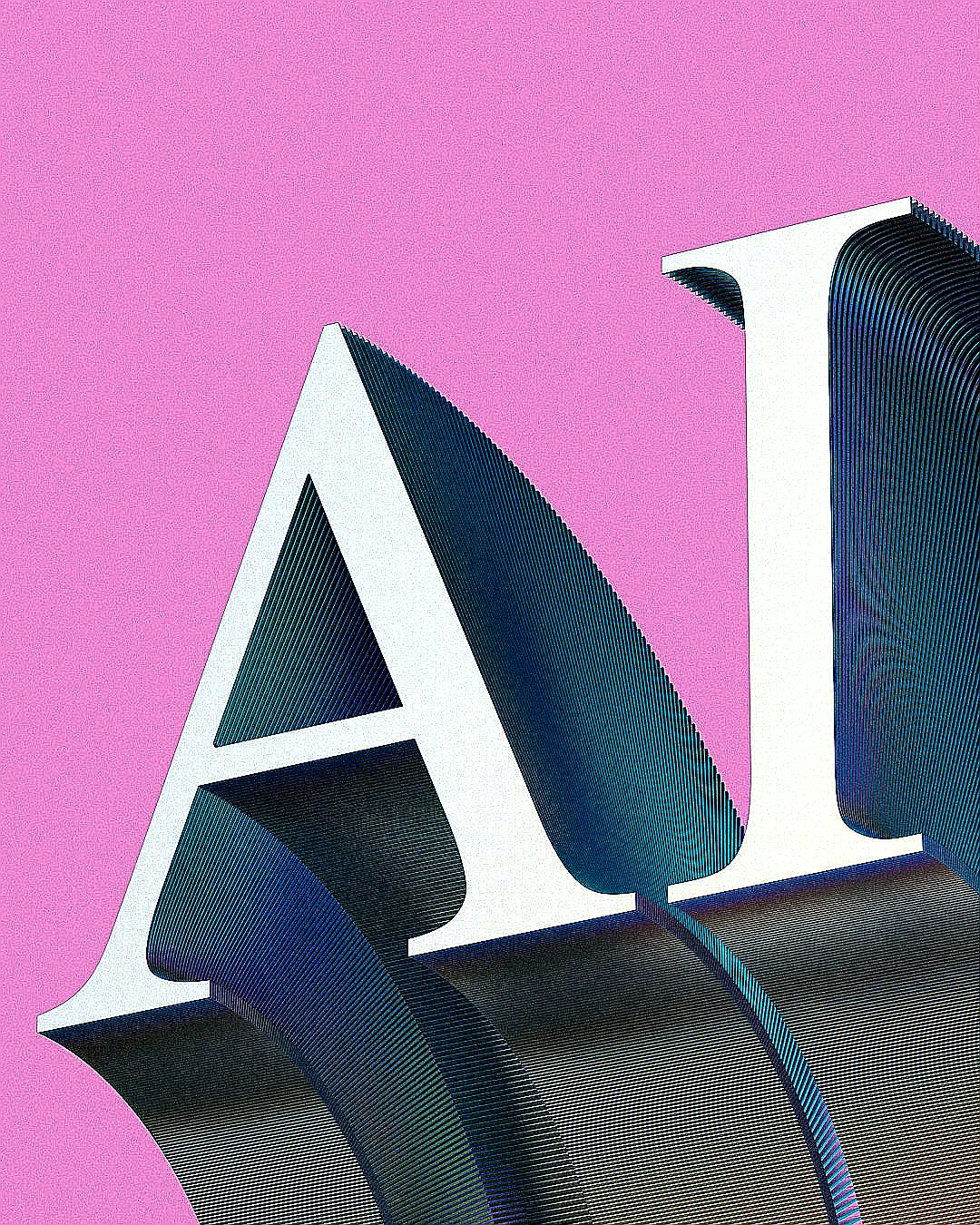
In the world of typography, most fonts are designed for one thing: clarity. But there is a new breed of 'decoy' lettering that isn't interested in being read—at least, not by a machine. As AI-driven scrapers and Optical Character Recognition (OCR) tools become more aggressive, developers are turning to visual trickery to hide data in plain sight.
The Science of Spatial Frequency
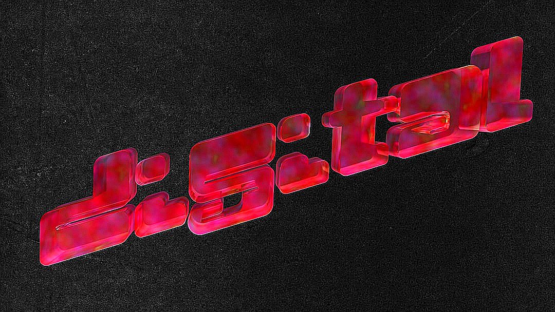
While there are many commercial fonts named 'Decoy' designed for Art Deco flair or branding, a specific technical application of the 'decoy' concept uses spatial frequency to baffle AI. The trick lies in splitting a letter's visual information. By manipulating the broad silhouette of a character versus its fine edges, the font occupies different bands of visual information. To a human eye, the letter is legible; to an AI, it's a confusing blur of noise that fails to trigger a correct character match.
A Cat-and-Mouse Game
This isn't a perfect shield, however. Experts suggest that this spatial-frequency trick may have an 'expiration date.' As machine learning models evolve to recognize patterns across wider frequency bands, the gap between human perception and machine recognition narrows. What works as a digital cloak today might become transparent to the next generation of neural networks tomorrow.
Whether it's a sophisticated security tool or a clever way to stop automated scrapers from stealing content, decoy typography reminds us that the battle for data privacy is often fought in the smallest details—right down to the pixels of a serif.
Sources
Media